Looking out for you
Colour Disclaimer
Open & Honest
Why Does This Exist?
At Impera Italia, we have been working with paints and plasters since 2010. Over this period, we have onboarded a wide range of materials, all available in hundreds, if not thousands of different colour options. As our business entered the digital age, we started to advertise our products online more and more. The internet gives us a fantastic platform to share our products with you, allowing us to expand the reach of our beautiful products far and wide. As we started to advertise our products online on more frequent occasions, we found one of the greatest challenges that are seemingly uncommon in other industries... Colour accuracy.
Over the years, we have used different methods to try and encapsulate the beauty and depth of the colours of our materials. Ranging from photographs, to scans, to manually matching samples using editing programs. We have really tried everything. We still regularly tweak colours each time we find one that we think could be improved. You will find on most websites online that sell paints, a colour disclaimer of some form, designed to protect the company in case the online colours as misjudged.
The fundamental issue of struggling to represent colour accurately on screens is not something that only affects Impera Italia. This is why most paint companies have always offered colour charts and sample pots. Even colour charts are often not made from real paints, but rather, are coated with lacquers to provide a representation of the colour.


What are we doing about this?
Our Process
We understand that colour is the single most important factor taken into consideration when purchasing a paint. We have spent a huge amount of time, money and resources to create the best possible environment in which to craft our online samples, in order to show them in their best possible light.
The latest iterations of our colour samples are closer than ever to their real life counterparts, thanks to investments in high-end, colour accurate monitors that are paired up with the latest pieces of software available.
We have tried to upload the best possible images and CGI’s
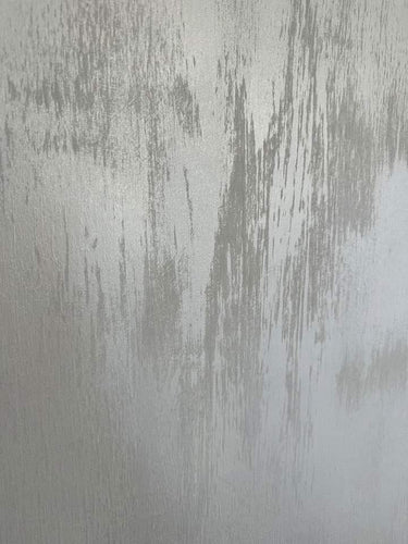
of our different products, in each of their respective colours. This can be difficult, especially as many of our products are metallic - making them highly reflective. On top of this, many colours are "Metameric". In simple terms, it means that these colours can appear seemingly the same, but will look different under different lighting conditions. Colour science is really a wonderful beast... We are very particular about the way we try to make our matches. We are not just trying to capture the main shade seen in each colour, but the subtle nuances, warmth, accent tones, as well as the level of black and white within the colour. Our aim is for you to be able to differentiate not just between reds and blues, = or browns and greys, but to be able to capture the essence of different shades of the same hue, no matter how subtle.
The limitations
Why We Should Be Careful
All this effort unfortunately can only help so much. The reality is that no matter how much we tweak our colours, they are still not guaranteed to look a certain way. Colours on screens are affected by a huge number of conditions that come into play that most of us may not even realise... Some examples of these are:
- Quality of the screen we are using.
- Brightness of the screen.
- Colour settings of the screen (blue light filters etc).
- Light that can be washing over the screen depending on the time of day.
- Brightness of the room in which we are using the screen.
- Contamination from other light sources around us.
- Our own individual ability to perceive colour.
- Tiredness, eye fatigue.
- Excessive exposure to different colours, leaving temporary shadows in our vision.
- Application techniques and tools used.
There are even more factors not mentioned below that can have an impact on our colour perception. For this reason, we cannot guarantee the accuracy of the colours viewed on our website.


So what are my options?
Before You Buy
We understand that often, decorating projects can creep up on us, before we know it, the decorator might tell us they only have availability over the next few days, or that holiday we had previously planned is now coming up, or perhaps, we just want to be done before our relatives come down for a special occasion. These pressures can often leave us without precious time with which to test out the colours or the materials we want to buy.
We cannot emphasise enough, how important it is that any product we want to buy, is tested in the colour we want to have it in, before we commit to purchasing the amount for a project. At Impera Italia, most of the products are bespoke made for each order. This means that when a colour is ordered in a specific material, the pigments are only added to fulfil that order specifically. This means that this order can no longer be cancelled, nor can the paint or plaster be returned for a refund.
This can come as devastating news when a large amount of product has been purchased, only to find out that we hate the colour that has been delivered. This can lead to a huge financial loss, especially when a decorator has already been paid to be on site on that day, and can no longer proceed with the job due to the colour not being right.
Doing it right
Being Ahead Of The Game
So how to avoid being put in this situation? Here are some tips from us to ensure that when you carry out your next project, you are not caught out!
- Start doing your research far enough in advance, to give yourself time to order colour charts for the desired materials. Colour charts are the most accurate resource available when it comes to ordering materials, especially when compared to digital options available, due to the points mentioned above.
- Once you have received your colour chart, select the colour you would like, and if the option is available on this product, purchase a sample. A sample of the material can be hugely important, especially if the samples on the colour chart are not of the actual paint / plaster. Paints and plasters will change under different lighting conditions. That is why, it is not just important to see the colour of the material, but it is even better practice to test the colour in the environment it will be applied. These also provide the opportunity to feel the material, which can be a way for the potential applicator to assure themselves that they will be able to carry out the project.
- When you have confirmed that the colour is accurate, and you like how it looks in the specific lighting environment you are going to have it in, you can proceed to order the complete amount for your project.
- A final top tip from us:
Do not book a date with your applicator until you have received the material. Accidents can happen both within our processes, as well as with couriers. We cannot take responsibility for any financial or time losses due to any mitigating circumstances.

Articles:
From the Blog

- Home Decor
- Home Renovation
- Interior Design
- Interior Trends
- Japandi-style
- Lime Eco
- Lime paint
- Limewash
- Minimalist
- Non-toxic
- Sustainable
How to Create a Limewash Finish with Lime Eco?

- Decorative Paint
- Gimcyn
- Impera Italia Paint
- Infinity
- Metallic Paint
- Sioloc
- Textured Paint
13 Different Ways to Apply Metallic Paint

- Home Decor
- Home Renovation
- Interior Design
- Interior styles
- Interior Trends
- Italian Decor
- Italian Finishes
- Lime paint
- Lime-based Plaster
- Limewash
- Polished Plaster
- Stucco Veneziano
- Venetian Plaster
What's Driving the Growing Interest in Italian Decor in Britain?
- Bathroom
- Eco-friendly
- Flooring
- Microcement
- Microcement Application
- Microcement Floor
- Microcemento
- Minimalist
- Non-toxic
- Venetian Plaster
- Water-resistant
Is Microcement Waterproof?